Wk 2 // colour play and imaginary landscapes
- Mar 2, 2023
- 4 min read
Updated: Mar 5, 2023
Colour theory has never been a strong suit of mine, but recently I've been thinking how colour is used as a semiotic device, and how certain colours are coded into understandings of nature. Colours associated with landscapes, particularly in relation to what is often considered picturesque, readable, idealised, and what is often chosen as photographable, are interesting to me at the moment when considering the Western idea of landscape as something to be looked at (object) from a viewing point (subject).
As a starting point, I picked up some colour swatches from Resene and sorted all those that were associated with natural environments, landscape or weather events into approximate categories. Initially I included those with specific place or plant names (Rangitoto Rock, Gorse, etc.) but decided to omit them in favour of keeping to more broad concepts (bush, sand, ocean, leaf, sunshine, etc.).


Much like the landscapes and objects the colours are linguistically associated with, it's hard to put them into individual boxes... Many of them could belong to multiple categories and can't be placed only in one; or are reminiscent of the memory/idea of a thing without being too much so that they stand in for it. Is bush a place, a feature of the landscape or an individual plant? Should moonlight be a cosmological thing or an element of the place it is observed? Does sea spray belong with the ocean or the atmosphere? (One of my classmates last year told me I talk like a robot sometimes and I'm starting to see why...) I don't think the world can be so easily organised, but it's kind of fun trying to based on this set of parameters.
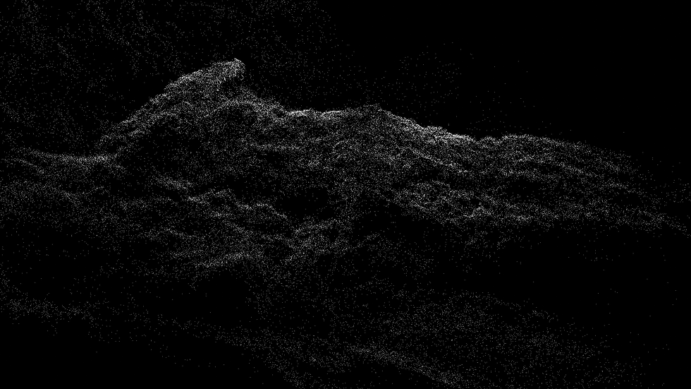
Taking some inspiration from the swatches, I applied a simple pixel effect to some recent footage of a lichen-covered tree branch, a macro video of grass, the water at Orakei basin and a mustard flower - not altering the colours present, just simplifying them:
I've also started exploring how I could use these different colours in Blender. It is possible to recolour pointclouds and other objects with specific colours with some basic shading settings. To keep things simple (and to refamiliarise myself with the process!) I've started by recoding one of my pointcloud files (a small piece of lichen-covered scoria) using some of the colours associated with both plant material and rock structures. I wanted to play with the ambiguity of the shape, and to see what would happen if I chose to visually represent it using colours that have been associated with certain forms and plant entities - lichen, rolling hills, wilderness, bush, ravine, big stone, earth green. There should also be a way to swap out certain colours for others, but I couldn't remember what node I needed for that...
At the same time, what happens when there is no colour in the record of a place, only shape/form/data? Can something of the natural still be held? Is it because landscape itself is so full of construct and make-believe that such emptied places still look recognisable, even if it's not a landscape at all? Is there a lack felt at all, and if so why? (thinking back on NASA's raw rover images vs. the "press ready" files)
I'm looking forward to seeing what happens when trying to capture/code more nebulous things like atmosphere or water, and what that outcome might look like. Some of the colours are pretty funky for what they are.
Collaborative swatches experiment

Following the litmus lichen information, I decided to make some simple pH reactive solution from red cabbage and painted it on some sturdy watercolour paper (though my blue/acid reactive litmus turned out more green than blue, whoops). I'm curious to see how it reacts to different water sources around the city... This isn't a project I'm going to pour a lot of attention into at present, but I'm finding it a nice way to get into being more curious about my surroundings and incorporating scientific elements and some kind of system into my practice.
Apparently it's also possible to create film developer and photosensitive pigments from certain plant substances, so I'm also trialling a small amount of my lichen dye to see if anything happens (it reacts ever so slightly to soda ash, so I half wonder if it does naturally have some reactive qualities). Might be an interesting alternative photography or image making process...

Misc knowledge of the day:
noun. res·ene. ˈreˌzēn. plural -s. :
any of various mixtures of neutral alkali-resistant compounds that are found in rosin and other natural resins and that contain carbon, hydrogen, and oxygen.
Shaun Waugh's Covenant Cut-Outs
I actually came across this work several days after posting this blog entry, but thought to include it here as I found it relevant. I have looked at Shaun Waugh's work in the past and am interested in his use of categorisation, photographic practices and digital media in his practice.
Waugh grew up in Taranaki, which is the location of the landscapes in his Covenant cut-out series. In his landscapes there is a vacuum, as if a suction has removed the patches of bush, and solid colour has taken its place. A void is made. Cut and colour, a form of deconstruction, renders a part of the image into nothingness; it shows intent, a hand. The landscape is not safe from manipulation. It is subject to whim and perception.
Shaun Waugh’s ‘Covenant cut-outs’ works are created using photos which he has digitally manipulated to ‘mask’ areas of landscape with abstract, flat areas of colour - erasing areas of bush growth. The series focuses on the topic of native tree and bush preservation on private farming land in relation to a landscape project initiated by the Queen Elizabeth II National Trust, which ensures "the preservation of natural and cultural features". By colouring in these areas with a palette defined by the colour picker chart available in the software he used for digital rendering, Waugh points out where private interest merges with public good.

Installation view of Covenant Cut-Outs, 2012-14; archival pigment print, dimensions variable. The Devil's Blind Spot, Christchurch Art Gallery Te Puna o Waiwhetū, 2017.


Comments